The Ultimate Guide to Choosing a Living Room Colour Scheme
Neutrals, jewel tones, coastal blues, earthy greens, greys, terracotta and pastels: how each palette changes the mood of a living room, and the rules that make any scheme work.
By Admin Published 6 min read

The living room is the social centre of the home. It is where we host guests, unwind after a long day and express our personal style. That makes its colour scheme one of the most important decisions in interior design. Colour does more than cover a surface: it sets the mood, changes how big the room feels and pulls different pieces of furniture together into one story.
Choosing the right palette takes a balance of instinct and know-how. This guide walks through seven palettes that work in living rooms, then the technical points (proportion, light and paint finish) that decide whether a scheme succeeds.
1. Neutral palettes
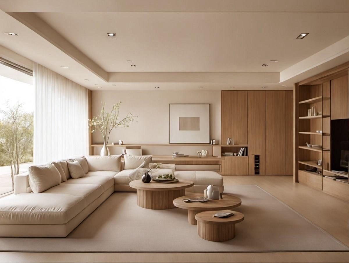
Neutral colour schemes are timeless, offering calm and architectural clarity. Neutrals are not boring: a well-executed neutral palette relies on a careful interplay of undertones and textures. Start by deciding whether your base is warm (yellow, pink or peach undertones) or cool (blue, green or violet undertones).
A warm neutral scheme of oatmeal, biscuit and taupe creates an inviting, cosy atmosphere, and works especially well in larger rooms that might otherwise feel cold. Cool neutrals such as silver, flint and crisp white give a sharp, gallery-like backdrop that shows off clean lines and modern shapes. To stop a neutral room feeling flat, layer textures (chunky knits, smooth marble, grained wood) to add depth in place of bold colour.
2. Jewel tones
For drama and opulence, jewel tones are hard to beat. Inspired by precious stones (emerald, sapphire, ruby and amethyst), these colours are highly saturated and carry real visual weight. A jewel-toned living room feels intimate, enveloping and decidedly high-end.
The secret is balance. If you paint the walls deep emerald, offset the weight with metallic accents like brass or gold, which reflect light and stop the room feeling cave-like. Jewel tones also pair beautifully with dark woods and velvet upholstery. Lighting matters here: warm, layered light from lamps and wall lights, rather than a single harsh ceiling light, brings out the glow of jewel colours and makes the room feel cosy and grand in the evening.
3. Coastal blues
Blue is one of the most popular colours for interiors, partly because so many people find it calming. A coastal blue scheme recalls the sea and the open sky, moving from pale duck-egg through to deeper navy accents, grounded by crisp whites and sandy beiges.
Think about which way the room faces. In north-facing rooms blue can look chilly, so choose blues with a slight green or red undertone to add warmth. In sunny, south-facing rooms a cool aqua or sky blue gives a refreshing contrast. The scheme works best with natural materials like jute, linen and light oak, which echo the textures of the shoreline.
4. Earthy greens
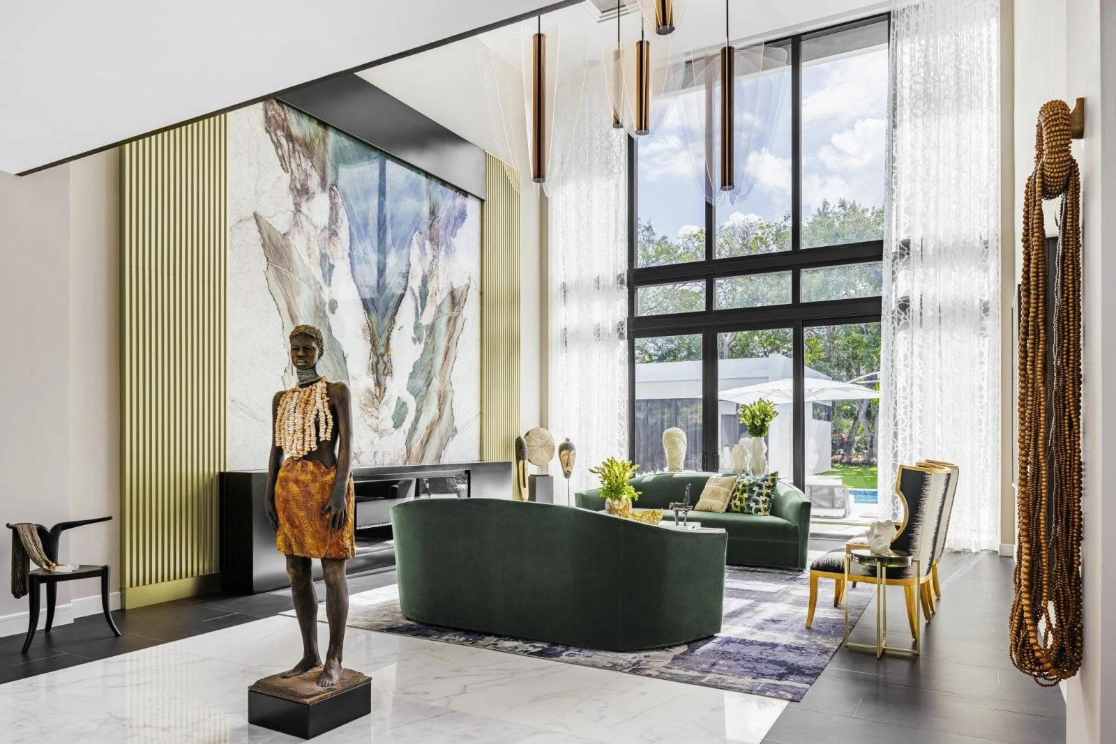
With the growing interest in biophilic design, earthy greens have become a staple of modern living rooms. Green links indoors and outdoors and suggests growth and renewal. From soft sage and olive to deep forest green, the palette is remarkably versatile.
Earthy greens behave like a new neutral: easy on the eye and happy alongside almost any wood tone. For a more sophisticated scheme, mix several shades from the same family. A sage wall gives a soft backdrop, while moss velvet cushions or a dark olive accent chair add contrast. Houseplants complete the look, adding real green texture that changes with the light.
5. Monochromatic greys
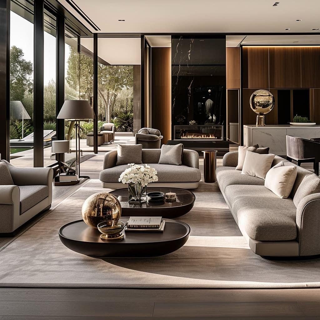
A monochromatic grey scheme is a hallmark of urban sophistication. Using different tints and shades of a single hue creates a look that is cohesive and highly structured. The key is value contrast: the difference between the lightest and darkest elements in the room.
If your walls are a mid-tone charcoal, choose a sofa that is clearly lighter (mist) or darker (slate) so the furniture does not disappear into the walls. Grey can read as blue, purple or even green depending on the light, so always test grey paint samples at different times of day to check the hidden undertones. To keep the room from feeling sterile, add matte black and polished chrome for a modern edge.
6. Warm terracotta
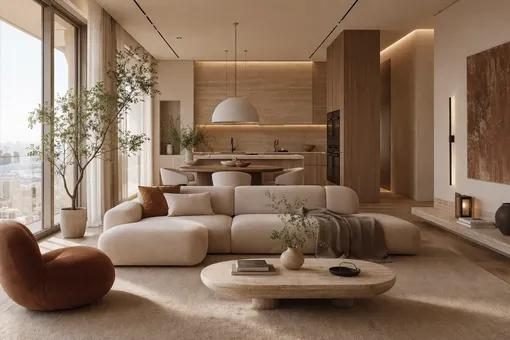
Baked earth tones like terracotta, sienna and ochre bring immediate warmth and energy to a living room. Inspired by natural clay and Mediterranean landscapes, the palette makes a space feel grounded and welcoming.
Terracotta looks its best in rooms with plenty of natural light, which intensifies its warmth. Because these colours are vibrant, pair them with grounding neutrals like cream, sand or charcoal. A terracotta accent wall, or large ceramics and textiles in the same tones, can turn a cold room into a glowing retreat. The palette also suits handmade pieces such as pottery, woven wall hangings and kilim rugs.
7. Pastel hues
Pastels have moved well beyond the nursery. Modern pastel schemes use softened, desaturated colours to create a room that feels bright, cheerful and spacious.
A dusty palette, such as muted pink with sage or lavender, gives a soft, contemporary feel. To keep pastels from looking too sweet, add anchoring elements: black metal hardware, dark wooden furniture legs or a crisp geometric rug give the visual weight needed to balance the lightness. Pastels also suit smaller living rooms, because their high light reflectance helps the walls recede and the space feel larger.
Technical considerations for your colour scheme
Beyond the colours themselves, a few technical points decide how well your scheme works:
- The 60-30-10 rule: a classic way to balance a palette. Around 60% of the room is the dominant colour (usually walls and rug), 30% the secondary colour (upholstery) and 10% the accent (cushions, artwork and accessories).
- Light reflectance value (LRV): every paint colour has an LRV from 0 (black) to 100 (pure white). If your living room is short on windows, choose colours with a higher LRV to bounce the light you have around the room.
- The effect of daylight: north-facing light is cool and bluish and can make colours look flatter; south-facing light is warm and can make them look more intense. View paint samples in the room itself, morning and evening, before you commit.
- Finishes and sheens: a matte finish absorbs light and hides imperfections, making colours look richer and deeper. Satin or eggshell has a slight sheen, reflects more light and is easier to clean, which makes it practical for busy living rooms.
Tip: Paint large samples (at least A4 size) on two different walls and live with them for a few days. Small swatches rarely show how a colour behaves across a whole room.
Bringing it together
Consider these points alongside a palette that suits your personal style, and you will have a living room that looks beautiful and reflects how you live. Whether you choose the quiet elegance of neutrals or the bold statement of jewel tones, the right colour scheme is the foundation of a beautiful home.
For more ideas, see our modern living room decorating ideas, compare wallpaper and paint, or read how to choose curtains for your living room. If you would like help choosing a palette, our living room decoration service covers colour, layout, lighting and styling, or you can book a consultation.


