Mastering the Palette: A Comprehensive Guide to Choosing Bedroom Colours
How to choose bedroom colours that feel restful, from colour moods and room orientation to soft blue, sage, greige, terracotta, charcoal, lavender, finishes and accents.
By Admin Published 6 min read

The bedroom is arguably the most important room in a home. It is a sanctuary for rest, a private retreat from the busy world, and the space where the day begins and ends. Because the room you sleep in shapes how relaxed you feel, choosing the right colour palette is about more than looks. The right hue can make a bedroom feel calmer and more inviting at the end of the day. This guide is a practical walk-through for selecting the perfect bedroom colours.
1. Colour and mood
How colour makes you feel is the foundation of interior design. Different colours create very different moods, so when selecting a bedroom colour, decide first what feeling you want the room to have.
- Cool tones: Blues, greens and soft purples are colours many people find restful. They echo the natural world, the sky, the sea and the forest, and create a sense of space and peace.
- Warm tones: Earthy reds, oranges and yellows feel secure and cosy. In their saturated forms, however, they can feel overstimulating. For bedrooms, they are best used in muted, “dusty” versions.
- Neutrals: Greys, beiges and whites provide a “blank canvas” effect, giving the room an uncluttered feel that helps you wind down before sleep.
2. Lighting
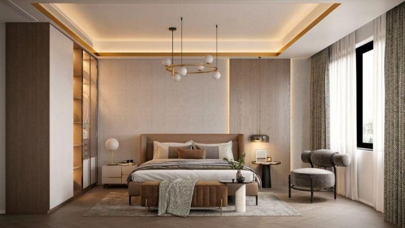
The way a colour looks on a swatch in a shop is never quite how it will look on your walls. Light is the most significant variable in paint selection.
- North-facing rooms: These rooms receive cool, bluish light, which can make cool greys or blues feel chilly. To counteract this, choose colours with warm undertones.
- South-facing rooms: These enjoy strong, warm light through the day. Almost any colour looks good here, though very light whites may feel glaring. This is the perfect setting for deeper, saturated tones.
- East- and west-facing rooms: These change dramatically through the day. A room that looks bright and cheerful in the morning (east) may look shadowy and grey by the afternoon. Always test patches on several walls to see how they change.
Tip: Paint large sample patches, or sample boards, and look at them in the morning, the afternoon and under your bedside lamps before you commit. A colour you love at noon can look quite different at bedtime.
3. Soft blue
Blue is one of the most popular bedroom colours, and many people find soft blues restful. It is associated with calm and stability.
- Sky blue: Best for small rooms to create an airy, open feeling.
- Navy blue: Ideal for creating a “cocoon” effect. Paired with gold or brass accents, it feels wonderfully luxurious.
- Slate blue: A sophisticated middle ground that leans towards grey, making it timeless and easy to pair with many furniture styles.
4. Sage green
Green suggests nature, growth and renewal. It is unique because it sits between the calm of blue and the freshness of yellow.
- Muted sage: This has become a modern classic. It acts almost like a neutral but adds a layer of organic depth.
- Deep forest green: Use this for a moody, grounded atmosphere. It works especially well in rooms with lots of natural wood furniture.
- Mint green: A lighter, vintage-inspired choice that works well in guest rooms or smaller spaces to keep them bright.
5. Warm greige
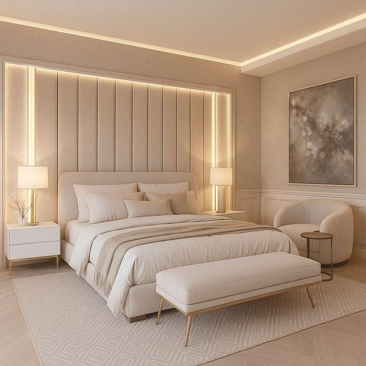
The move from cold “millennial grey” to “greige” (a mix of grey and beige) has changed bedroom design. Greige offers the sophistication of grey without the clinical coldness.
- Versatility: Greige works with both cool and warm accents. You can change your bedding from blue to orange without needing to repaint.
- Timelessness: Unlike trendy bold colours, a good greige rarely goes out of style, so you are less likely to want to repaint in a few years.
- Reflectivity: Lighter greiges have a fairly high Light Reflectance Value (LRV), keeping the room feeling bright during the day while remaining cosy at night.
6. Terracotta
For those who find cool tones too sterile, earthy reds and oranges bring a grounded feel. Terracotta, clay and sienna are evocative of the earth.
- Visual warmth: These colours make a room look and feel warmer and cosier, which many people appreciate in colder climates.
- Textural pairing: These hues look best paired with “raw” materials like linen, stone and unpolished wood.
- Muted saturation: Choose a chalky or matte finish and a softened shade to avoid the intensity of bright orange, which can feel too lively for a room meant for rest.
7. Charcoal grey
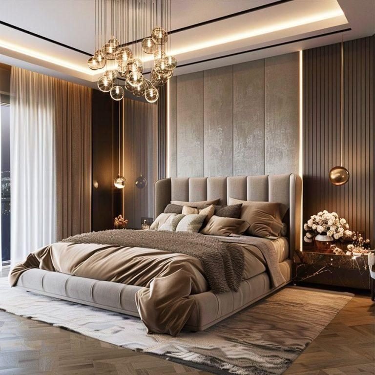
Dark walls do not necessarily make a room feel smaller; instead, they blur the corners of the room, creating a sense of depth.
- The “hotel” feel: Darker tones like charcoal or espresso give a high-end, boutique hotel look.
- Focus on furniture: Dark walls act as a backdrop for your furniture, making a beautiful bed frame or artwork stand out.
- A cocooning mood: Many people find a darker, enveloping room feels snug and helps them wind down in the evening, especially when paired with good blackout curtains.
8. Lavender
Lavender is often overlooked but is a lovely choice for a relaxing room. It offers the gentleness of pink without being overly sugary, and the calm of blue without being cold.
- Floral influence: It brings a subtle hint of the outdoors inside.
- Pairing with neutrals: Lavender looks stunning paired with cool greys or crisp whites.
- Subtlety is key: Choose a lavender with a strong grey undertone so the room feels sophisticated rather than childish.
9. Finishes
Once you have chosen the hue, the sheen or finish is your final technical decision.
- Matte/flat: Best for bedrooms. It absorbs light rather than reflecting it, which hides wall imperfections and creates a soft, velvety look that suits a restful room.
- Eggshell: A slight step up in durability and sheen. It is easier to clean than matte, making it a good choice for children’s bedrooms.
- Satin/semi-gloss: Generally avoided for bedroom walls, as the high reflection can create distracting “hot spots” from lamps when you are trying to rest. Save these for the woodwork and skirting boards.
10. Accents
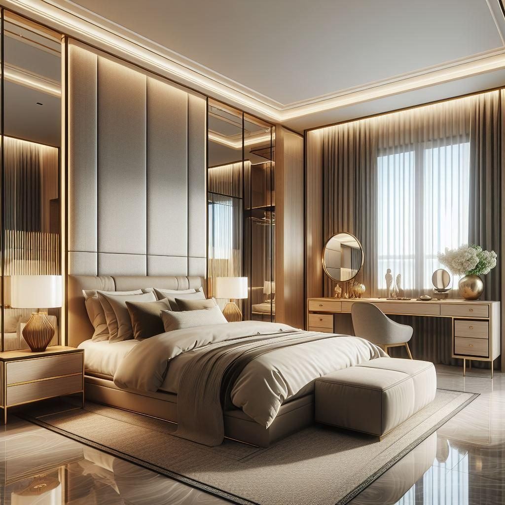
If you are hesitant to commit to a bold colour on all four walls, the accent wall remains a powerful design tool.
- The headboard wall: This is the traditional choice. It creates a focal point and lets you use a darker colour that you do not look at while lying in bed, so the room still feels bright around you.
- The ceiling (the fifth wall): Painting the ceiling a shade lighter or darker than the walls can create a “jewel box” effect that feels wonderfully intimate.
- Cohesion: Make sure your accent colour is picked up elsewhere in the room, perhaps in a rug, a piece of art or a throw, so the room feels curated rather than accidental.
Choosing your palette
There is no single right colour for a bedroom, only the one that makes you feel at ease when you close the door. Start with the mood you want, test your shortlist in your own light, and choose a finish and accents that bring the whole scheme together.
For a wider look at planning the room, read our guide to decorating a bedroom, compare wallpaper vs paint, or borrow ideas from our living room colour scheme guide. Our bedroom decoration service can help you choose and apply the right palette, or you can book a consultation.


