High-Contrast Decor for Low Vision: A Designer’s Guide to a Clearer, Calmer Home
How to use colour contrast, glare-free lighting, matte finishes, clear pathways and tactile cues to make a home easier to read for people with low vision, without losing style.
By Admin Published 8 min read

Good design for low vision is not about making a home look clinical. It is about making the room easier to read: where the floor ends and the wall begins, where the edge of a step is, which surface is the table and which is the chair. Most of that comes down to contrast, light and clutter, and all three can be handled in a way that looks considered and stylish.
Every eye condition is different. Some people see better in bright light, others are troubled by glare; some lose central vision, others peripheral. The ideas below are general design principles, not a prescription. For a personal assessment, speak to an occupational therapist or a sight-loss charity, who can look at the person’s actual vision and the home they live in.
Why contrast matters more than colour
When designers talk about contrast for low vision, they mean the difference in lightness between two surfaces, not just a difference in hue. A sage green sofa against a mid-grey wall may look like two distinct colours to someone with typical sight, but if both have similar lightness they can blur into one shape. A pale sofa against a deep wall, or a dark chair on a light floor, is far easier to pick out.
A simple test: take a photo of the room on your phone and convert it to black and white. Anything that disappears into its background in the greyscale version is a candidate for more contrast. Paint manufacturers also publish a light reflectance value (LRV) for each colour; a larger gap between the LRVs of two neighbouring surfaces generally means stronger visual contrast.
Contrast between floors, walls and furniture
Start with the three big planes of the room and build from there:
- Floor against wall: a clear tonal difference helps define the shape of the room. If walls and floor are both pale, a contrasting skirting board, painted a shade or two darker than the walls, draws a line where one meets the other.
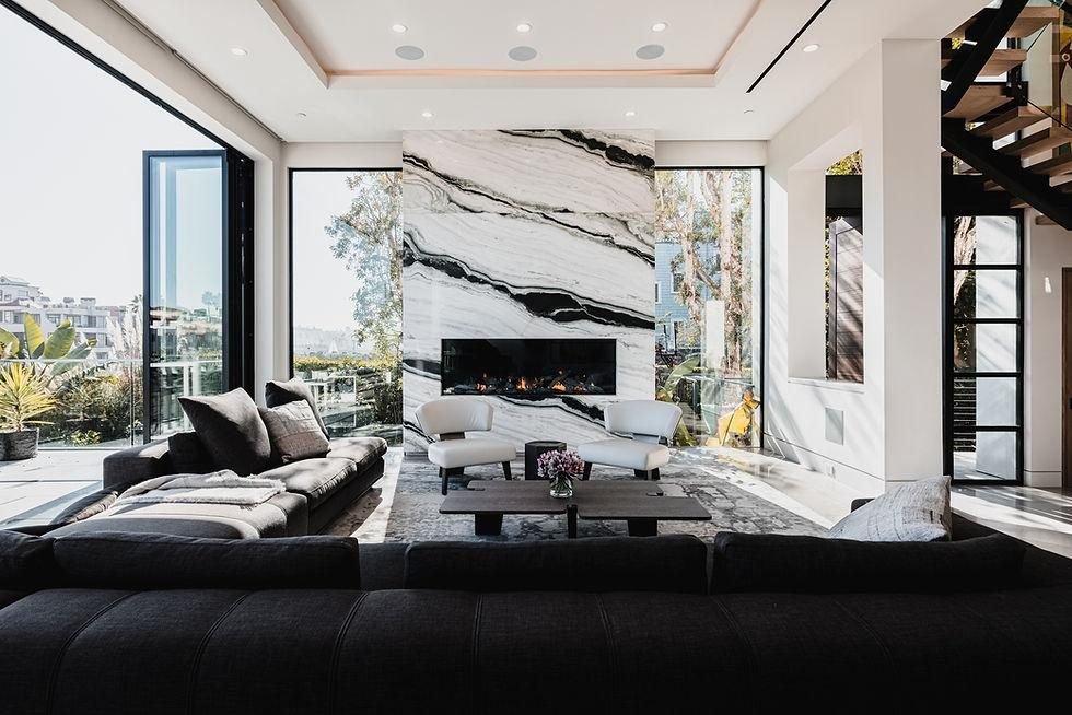
- Furniture against floor: choose sofas, beds and tables that stand out from the floor beneath them. On pale oak, a charcoal or navy sofa reads clearly; on a dark floor, cream or light upholstery works better.
- Furniture against wall: avoid placing a white cabinet against a white wall. If you love tonal schemes, add contrast with a darker throw over the arm of a sofa or a contrasting cushion on the seat edge.
- Doors and frames: painting door frames (architraves) or the doors themselves in a contrasting shade makes doorways easy to find. A darker door handle on a light door, or the reverse, helps too.
Contrasting edges on steps, worktops and thresholds
Edges are where most trips and knocks happen, so they deserve particular attention.
- Stairs: a contrasting strip along the front edge (the nosing) of each step, typically around 50 mm (2 in) deep on the tread and a narrower band on the riser, makes each step visible. Many stair nosings are made for exactly this purpose; ask a fitter about anti-slip versions and check building regulations if you are altering a staircase.
- Single steps and level changes: a lone step down into a sunken room or garden is easy to miss. Mark it with a contrasting edge and make sure it is well lit.
- Worktops and tables: a dark worktop against pale cabinets, or a contrasting edge band, helps someone judge where the surface ends before putting down a cup or plate. On a dining table, a plain contrasting placemat under a plain plate does the same job.
- Light switches and sockets: white switches on white walls can be hard to locate. Contrasting plates, or a contrasting surround behind a white plate, make them easier to find. Any rewiring or new fittings should be done by a qualified electrician.
- Handrails: a handrail in a tone that stands out from the wall is easier to find and follow.
Even, glare-free lighting
Many people with low vision need more light than average, but more light is only helpful if it is even and glare-free. Pools of bright light next to dark corners force the eyes to keep readjusting, and a bare bulb in the line of sight can be dazzling.
- Layer the light: combine an even general light with task lights where close work happens: reading, cooking, grooming. Our layered lighting guide explains how to build each layer.
- Shield the source: choose shades and diffusers that hide the bulb from normal sitting and standing positions. Opal glass, fabric drums and uplighters spread light softly.
- Light the transitions: hallways, stairs and the route from bed to bathroom should be lit consistently, with switches at both ends of a staircase. Low-level night lights or plug-in sensor lights help at night.
- Manage daylight: sheer curtains, voiles or adjustable blinds cut the harsh glare from a low winter sun without making the room dark.
- Keep colour consistent: stick to one colour temperature of bulb in each room so that colours and contrasts look the same wherever the person is standing.
Tip: Sit in each chair and stand at each worktop at different times of day, and note where light hits your eyes or bounces off a surface. Glare is much easier to spot from the user’s own viewpoint than from the doorway.
Choose matte finishes over gloss
Shiny surfaces reflect light back into the eyes and can create bright patches that hide what is underneath. Polished floors can also look wet, which may make someone hesitate or change their step.
- Use matte or eggshell paint on walls rather than gloss or high-sheen finishes.
- Prefer honed or matte tiles, matte laminate and oiled rather than lacquered wood for floors.
- Choose satin or matte worktops in kitchens, where task lighting is bright and close.
- Limit large mirrors and glass tables, or position them so they do not catch a window or lamp. Glass doors and full-height glass panels benefit from contrasting markings at eye level.
Clear pathways and a predictable layout
A home that stays arranged the same way is easier to navigate by memory as well as by sight. Agree a layout with the person who lives there, and keep it consistent.
- Keep main walkways at least 90 cm (36 in) wide, and wider where a walking aid is used.
- Remove low furniture, such as footstools and side tables, from routes people use regularly, or place them firmly against walls.
- Avoid loose rugs on walkways. If you keep a rug, choose one with a low pile that contrasts with the floor, and secure it with a suitable non-slip underlay.
- Tidy trailing cables to the edges of the room.
- Keep doors either fully open or fully closed; a half-open door edge is hard to see.
If someone in the household also uses a wheelchair, the same principles of clear, wide routes become even more important. In a small apartment, decor for wheelchair users usually means choosing fewer, slimmer pieces, wall-mounted storage and a turning space free of furniture; our small living room furniture guide has layout ideas you can adapt.
Avoid busy patterns on floors and key surfaces
Strong patterns can confuse depth perception. Bold stripes on a floor may look like steps, dark spots can look like holes, and a busy geometric carpet on a staircase can hide the edges of the treads entirely.
- Choose plain or very subtly textured flooring, especially on stairs and in hallways.
- Keep pattern for places where it cannot be mistaken for a change in level: a cushion, a lampshade, an upholstered headboard or artwork on the wall.
- Avoid patterned worktops and tablecloths where people need to find small objects; plain surfaces make keys, cups and cutlery easier to spot.
- Keep display shelves edited. A few larger objects in contrasting tones read more clearly than many small ones.
Tactile cues and texture
Touch can confirm what the eyes are unsure of, and texture is also one of the best ways to add warmth to a scheme.
- Use different textures to mark zones: a wool rug in the seating area, a smooth floor in the kitchen, a ribbed runner at the top of the stairs (secured flat).
- Choose handles and knobs with a distinctive shape so cupboards can be identified by feel.
- Add raised bump-on markers to frequently used settings on cookers, washing machines and thermostats.
- Pick throws and cushions in contrasting textures as well as contrasting tones: a chunky knit on a smooth leather chair is easy to find both ways.
Getting personal advice
Everything above works best when it is tailored to the person. An occupational therapist can assess how someone moves around their home and suggest adaptations, and sight-loss charities offer advice on lighting, contrast and daily living aids. Involve the person who lives there in every choice: it is their home, and the most successful schemes are the ones they find comfortable and attractive, not just practical.
For more on lighting and colour, read our guides to layered lighting room by room and living room colour schemes, or explore our full home decoration service. To plan a clearer, more comfortable home together, book a consultation.


