The Art of Kitchen Cabinet Colour Combinations
Ten kitchen cabinet colour combinations that work, from navy and white to sage and oak, black and gold and teal and copper, plus the design rules for choosing your own pairing.
By Admin Published 6 min read

The kitchen is often described as the heart of the home, a central hub where function meets aesthetic expression. In contemporary interior design, the choice of cabinet colours has evolved beyond simple monochrome palettes into a sophisticated play of tones, textures and contrasts. Choosing the right colour combination for your kitchen cabinets is not merely a decorative choice; it shapes how large the room feels, the mood it sets and the overall character of your home.
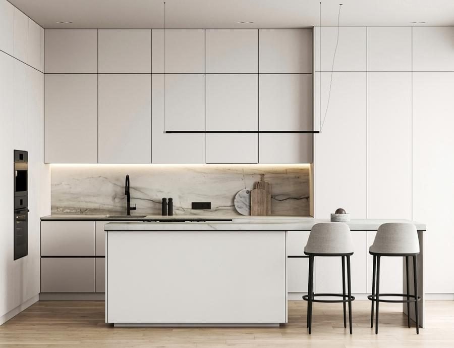
As tastes move away from the stark, all-white kitchens of the past decade, designers are embracing two-tone cabinetry and “tuxedo” styles to add depth and architectural interest. This guide explores the most compelling kitchen cabinet colour combinations, why these pairings work and how to use them in your own home.
1. Navy and white
Navy blue and white is a timeless pairing that strikes a perfect balance between traditional elegance and modern crispness. Often called the “tuxedo” look when applied to cabinetry, it uses the weight of dark navy on the lower cabinets to ground the space, while white upper cabinets draw the eye upward and make the ceiling feel higher.
This combination is particularly effective in kitchens with plenty of natural light. Navy brings drama and sophistication without being as harsh as black. To elevate the look, warm metallic accents such as brushed brass or champagne gold hardware stand out beautifully against the deep blue.
2. Sage and oak
Biophilic design, which seeks to connect indoor spaces with the natural world, has helped make sage green one of the most popular cabinet colours. Paired with natural oak or other light woods, sage creates a serene, organic atmosphere that feels both fresh and grounded.
This combination works especially well in farmhouse, cottage or Scandinavian-inspired homes. The warmth of the oak balances the coolness of the green, giving a kitchen that feels cosy and lived-in. For a cohesive look, add matte black hardware or simple wooden knobs to keep the organic feel.
3. Charcoal and walnut
For a high-end, tailored or industrial feel, charcoal grey and walnut make a superb pairing. Charcoal offers a moody, sophisticated backdrop that is slightly softer than pure black, while walnut brings a rich, complex grain that adds warmth and luxury.
Here, texture matters as much as colour. The matte finish of charcoal cabinets contrasts beautifully with the smooth, oiled surface of walnut. The duo is ideal for open-plan spaces where the kitchen should look like a piece of fine furniture rather than a utilitarian workspace.
4. Black and gold
Black cabinetry is a bold statement that exudes confidence and modernity. An all-black kitchen can feel heavy if it is not balanced well, but gold or brass elements transform the black from “dark” to “deluxe”.
The key is the finish. Matte black absorbs light and shows fingerprints less than gloss, while reflective gold surfaces bounce light back into the room. The pairing often sits alongside white marble worktops with gold veining, which bridge the gap between the dark cabinets and the bright hardware.
5. Cream and taupe
If pure white feels too clinical but you still want a light, airy kitchen, cream and taupe is the ideal solution. These “new neutrals” offer more warmth and depth than standard white or grey.
Painting the perimeter cabinets a soft cream and the island, or one bank of cabinets, a warm taupe creates a subtle contrast that feels sophisticated and intentional. The palette is very versatile and works with a range of finishes, from polished nickel to oil-rubbed bronze.
6. Forest green and marble
Forest green has become a favourite for luxury kitchen renovations. It evokes a sense of heritage and permanence, and paired with the bright, cool tones of white marble, the result feels both historic and contemporary.
This combination thrives on contrast. The visual weight of the dark green makes white marble surfaces appear even brighter. To complete the look, consider bridge taps and traditional hardware to lean into the English country style the palette suggests.
7. Sky blue and white
For a kitchen that feels like a breath of fresh air, look to sky blue and white. The combination is a staple of coastal and Hamptons-style interiors: light, cheerful and calm.
A soft blue on the lower cabinets or the island stops the space from feeling washed out while keeping it bright. The pairing suits smaller kitchens particularly well, as light colours help the room feel larger. Add wicker bar stools and glass pendants to enhance the breezy, relaxed mood.
8. Grey and yellow
If you want to inject personality and energy into your kitchen, grey and yellow is a contemporary and daring choice. Grey provides a stable, neutral foundation that tempers the brightness of yellow.
The usual approach is grey for most of the cabinetry, with yellow as an accent: a tiled splashback, the inside of open shelves or even a single vibrant island. It is a modern pairing that feels optimistic and architectural.
9. Teal and copper
Teal sits between blue and green, offering the best of both: it is rich and soulful. Paired with the reddish-orange tones of copper, the two colours sit roughly opposite each other on the colour wheel, creating a vibrant complementary contrast.
The warmth of copper cuts through the coolness of teal, making the kitchen feel inviting. This combination is perfect if you love jewel tones and want a kitchen that feels unique and artisanal.
10. Espresso and cream
Espresso-stained wood with cream is a hallmark of transitional design. It offers a high-contrast look that is warmer and more traditional than black and white.
A dark espresso stain lets the natural wood grain show through, giving a texture that painted cabinets cannot replicate. With cream worktops and splashbacks, the kitchen feels grounded and substantial. It is a reliable choice if you would rather avoid short-lived trends.
Tips for choosing your combination
When selecting your kitchen cabinet colours, keep these design principles in mind:
- The 60-30-10 rule: aim for roughly 60% of a dominant colour (usually the perimeter cabinets), 30% of a secondary colour (the island or lower cabinets) and 10% of an accent colour (hardware and decor).
- Lighting matters: always test paint samples in your kitchen at different times of day. A navy that looks royal in a showroom can read almost black in a north-facing kitchen.
- Balance the weight: as a general rule, keep darker colours low and lighter colours high. This stops the kitchen feeling top-heavy and keeps it open and airy.
- Hardware as the bridge: use your handles to tie the two colours together. With green and wood cabinets, for example, the same black handles on both create a sense of unity.
Tip: Paint large sample boards rather than small swatches, and view them next to your worktop and flooring samples before you commit.
By choosing a colour combination that reflects your personal style and following these principles, you can turn your kitchen into a stunning feature of your home.
For more on styles, lighting and surfaces, read our complete guide to kitchen decoration and our small kitchen decorating ideas, or explore our kitchen decoration service. To find the right palette for your own kitchen, book a consultation.


